

Block Side Menu
The Block Side Menu appears whenever you hover over a block, and is used to drag & drop the block as well as add new ones below it.

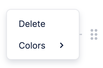
You can also click the drag handle in the Block Side Menu (⠿) to open the Drag Handle Menu.
Custom Drag Handle Menu
BlockNote lets you customize which items appear in the Drag Handle Menu. Have a look at the example below, in which the color picker item is replaced with a custom item that opens an alert.
Let's look at how this is done. We first need to create a custom Drag Handle Menu using a React component. This component should take the following props:
type CustomDragHandleMenuProps = {
  editor: BlockNoteEditor;
  block: Block;
  closeMenu: () => void;
};
const CustomDragHandleMenu = (props: CustomDragHandleMenuProps): JSX.Element => ...;
You can then tell BlockNote to use your custom Drag Handle Menu using the customElements option in useBlockNote:
const editor = useBlockNote({
  customElements: {
    blockSideMenuFactory: CustomBlockSideMenu
  },
});
Default Items
It might seem daunting to create your own Drag Handle Menu from scratch, which is why BlockNote provides React components for everything you see in the default layout - both the menu itself and the items in it. Below are all the default components you can use to build your custom menu:
// Menu which wraps all the items.
type BlockSideMenuProps = {
  children: ReactNode
}
const BlockSideMenu = (props: BlockSideMenuProps) => ...;

// Button which removes the block.
type RemoveBlockButtonProps = {
  editor: BlockNoteEditor;
  block: Block;
  closeMenu: () => void;
  children: ReactNode;
};
const RemoveBlockButton = (props: RemoveBlockButtonProps) => ...;

// Button which opens a dropdown on hover. The dropdown lets you set the block's color.
type BlockColorsButtonProps = {
  editor: BlockNoteEditor;
  block: Block;
  closeMenu: () => void;
  children: ReactNode;
};
const BlockColorsButton = (props: BlockColorsButtonProps) => ...;
Custom Items
BlockNote also provides components that you can use to make your own menu items, which match BlockNote's UI styling:
// Also includes all props of button elements, e.g. onClick.
type DragHandleMenuItemProps = {
  // Closes the menu when called.
  closeMenu: () => void;
};
export const DragHandleMenuItem = (props: DragHandleMenuItemProps) => ...;